Learning A-Z Blog Redesign
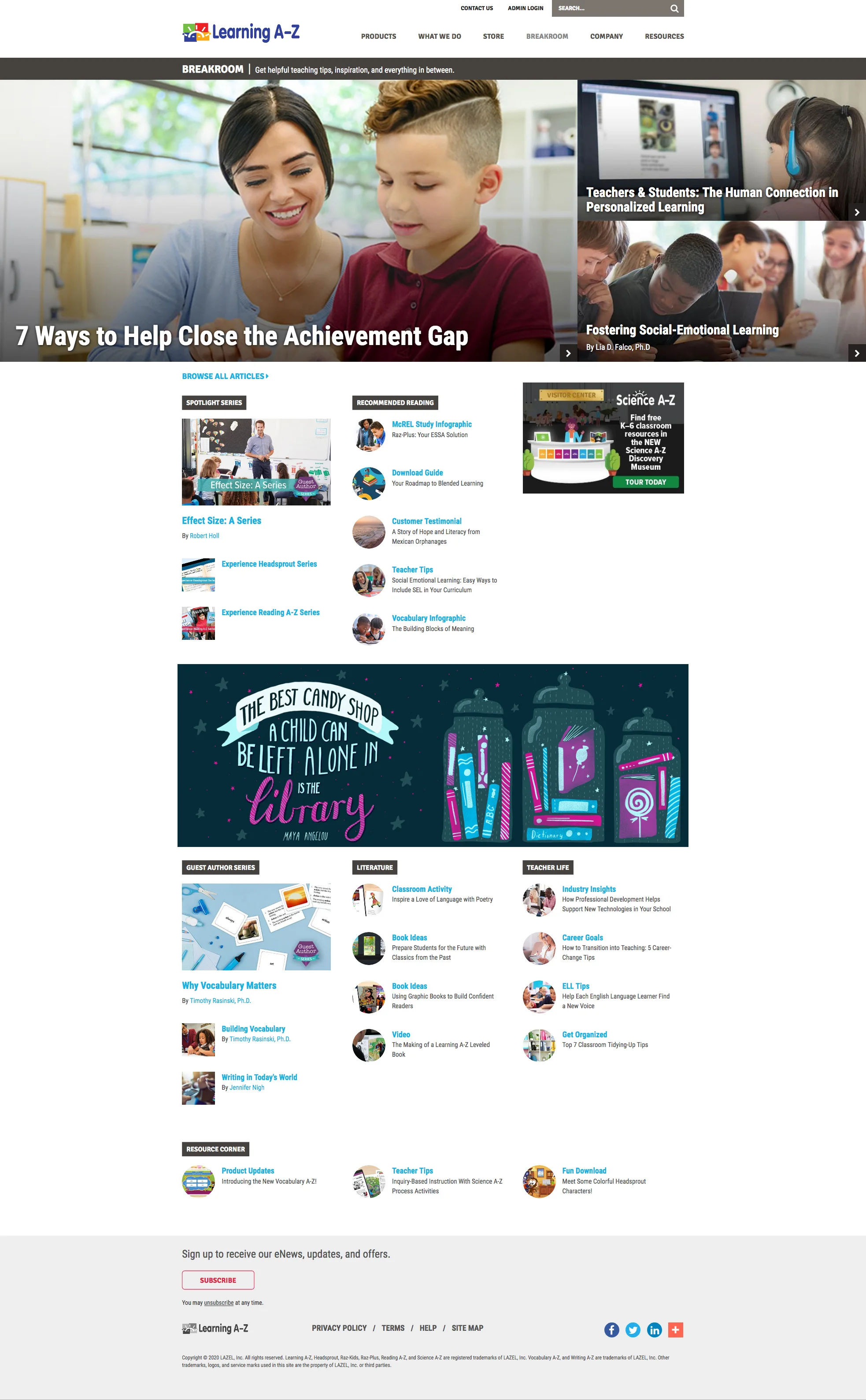
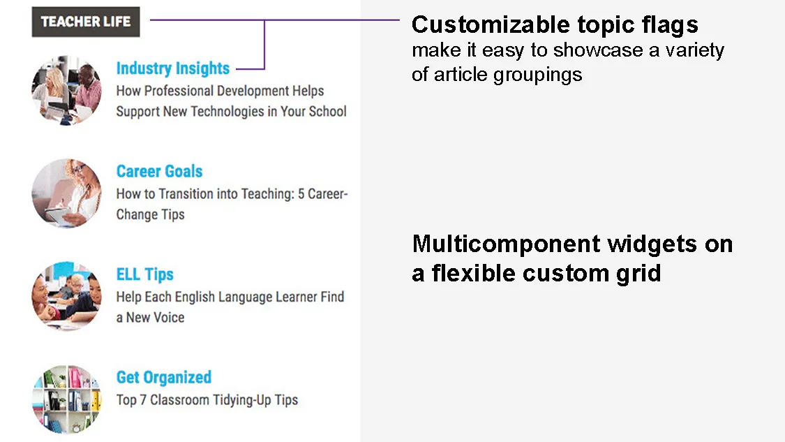
I redesigned the Learning A-Z corporate blog homepage into a dynamic, news-style landing page. The goal was to move away from a static chronological list and toward a flexible hub that highlighted categories, seasonal initiatives, and featured stories. I designed a modular grid system with customizable widgets and topic flags, making the blog both visually engaging and adaptable to evolving content needs.
Role
UX Design, Art Direction, Visual Design
Timeline
2019
Team / Collaboration
Creative direction, content team, web development agency
Tools
Adobe Creative Suite, Wireframing tools, CMS
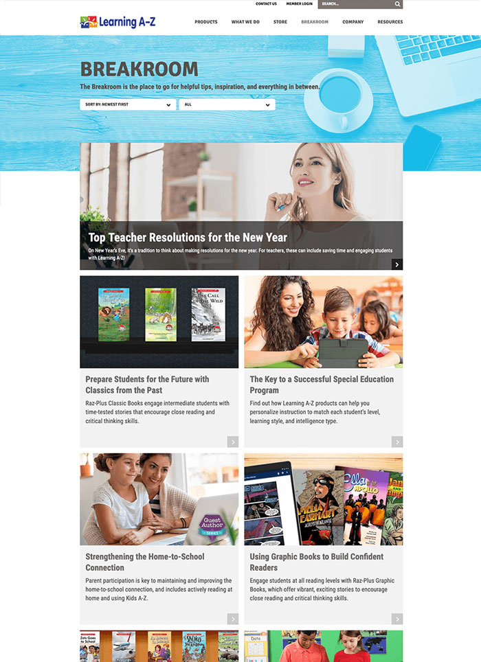
Before
After
The Challenge
The original blog homepage presented posts as a long, scrolling list, making it difficult to surface older but relevant content. The challenge was to redesign the blog into an index-style hub that better supported content discovery, flexibility, and storytelling.
Key challenges included:
- Showcasing multiple topics simultaneously without overwhelming the reader
- Ensuring seasonal initiatives could be promoted clearly within the layout
- Creating a grid system flexible enough to adapt to future content needs
- Balancing clean UX with a branded, editorial design aesthetic
The Process
- Research: Analyzed blogs, magazine layouts, and online resource hubs to identify best practices for categorization and layout.
- Wireframing: Created flexible wireframes with components that could shift based on priorities and campaigns.
- Custom Topic Flags: Designed reusable, customizable flags for topics and seasonal initiatives.
- Flexible Grid: Built a modular grid system allowing stories and initiatives to be featured in multiple configurations.
- Visual Redesign: Translated wireframes into a polished design that aligned with Learning A-Z’s brand and editorial voice.
- Collaboration: Partnered with Moncur Design Studio for development, ensuring feasibility within CMS constraints.
The Outcome
- Successfully launched a redesigned blog that became a content hub instead of a list.
- Increased visibility for evergreen and seasonal content.
- Provided content teams with a flexible system that adapted to campaigns and initiatives.
- Elevated the blog to feel more like an editorial resource than a corporate announcement board.
Reflection / Takeaways
- Reinforced my ability to merge UX research with branded design.
- Demonstrated the value of building modular, future-proof systems for content-heavy experiences.
- Showed how small structural changes can dramatically improve content discoverability and engagement.